How to Use Color to Highlight Exterior Architectural Features explores the transformative power of color in exterior design. Understanding color theory and its psychological impact is key to enhancing architectural details and creating a visually stunning and cohesive aesthetic. We’ll delve into practical techniques, considering environmental factors and building materials to guide you in choosing the perfect palette to accentuate your home’s unique features.
From understanding color harmonies and temperature to mastering techniques like accent walls and color blocking, this guide provides a comprehensive approach to exterior color selection. We’ll examine case studies showcasing successful applications, ensuring you’re equipped with the knowledge and confidence to elevate your home’s curb appeal through strategic color choices.
The Power of Color in Exterior Design
Color is a powerful tool in architectural design, capable of dramatically altering the perception of a building’s form, size, and even mood. Strategic color choices can emphasize specific architectural features, creating visual interest and enhancing the overall aesthetic appeal. The skillful use of color can transform a mundane structure into a striking and memorable landmark.
The psychological impact of color is significant. Different hues evoke distinct emotional responses in viewers. For instance, warm colors like reds and oranges often convey feelings of energy and excitement, while cool colors such as blues and greens tend to project calmness and serenity. Understanding these psychological associations is crucial for architects and designers aiming to create a specific atmosphere or communicate a particular message through their design.
Color Schemes for Highlighting Architectural Details
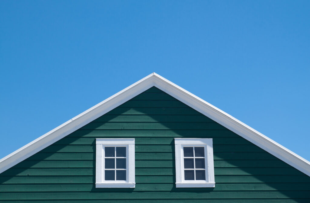
Successful color schemes often employ contrasting colors to highlight key features. For example, a light-colored building with dark trim around windows and doors will draw the eye to these details, emphasizing their importance within the overall design. Conversely, a dark building with lighter accents can achieve a similar effect, creating a sense of depth and visual interest. The use of complementary colors (colors opposite each other on the color wheel) can also be highly effective, resulting in a vibrant and dynamic composition. Consider a building with a deep red brick facade accented by teal window frames; the contrasting hues create a visually arresting effect.
Examples of Successful Color Application
A classic example of effective color use is found in many Mediterranean-style homes. The use of warm, earthy tones like terracotta and ochre, often combined with white or cream accents, highlights the building’s texture and creates a sense of warmth and hospitality. The white accents, particularly around window and door frames, further emphasize these architectural details against the warm backdrop.
Another successful application is seen in modern minimalist architecture. Often, these buildings employ a restrained palette of neutral colors like grays, whites, and blacks, punctuated by pops of bright color strategically placed to draw attention to specific features. A single bold color, such as a vibrant blue or sunny yellow, used for a front door or a portion of the facade, can create a focal point and add a touch of personality to the otherwise understated design.
Choosing the Right Colors
Selecting the right exterior paint colors is crucial for enhancing your home’s architectural features and creating a desired aesthetic. Understanding color theory provides a framework for making informed decisions that go beyond personal preference, ensuring a harmonious and visually appealing result.
Color theory, at its core, explores the relationships between colors and how they interact to create different effects. This involves considering hue (the pure color), saturation (the intensity or purity of the color), and value (the lightness or darkness of the color). By manipulating these elements, designers can achieve a wide range of moods and visual impacts.
Color Temperature and Mood
Color temperature significantly influences the perceived mood of an exterior design. Warm colors, such as reds, oranges, and yellows, evoke feelings of warmth, comfort, and energy. They can make a home feel inviting and welcoming, particularly effective in colder climates. Conversely, cool colors, including blues, greens, and purples, project a sense of calmness, serenity, and sophistication. Cool colors can make a space feel larger and more airy, a beneficial choice for smaller homes or those in warmer climates. For example, a sunny, south-facing home might benefit from cooler blues to offset the abundance of sunlight, while a north-facing home might be enhanced by warmer tones to create a more inviting atmosphere.
Color Harmonies in Exterior Design
Different color harmonies offer distinct visual effects and are best suited to different architectural styles.
Complementary colors, situated directly opposite each other on the color wheel (e.g., red and green, blue and orange), create high contrast and visual excitement. Used judiciously, this can highlight architectural details. However, overuse can be jarring. A Victorian home, with its intricate details, might benefit from carefully chosen complementary accents to highlight specific features, while a minimalist modern home might find this combination too visually busy.
Analogous colors, located next to each other on the color wheel (e.g., blue, blue-green, green), create a sense of harmony and tranquility. This scheme works well for creating a cohesive and soothing exterior. A traditional Cape Cod style home, with its emphasis on simplicity and natural materials, would likely benefit from an analogous color scheme using muted greens and blues.
Triadic colors, evenly spaced on the color wheel (e.g., red, yellow, blue), offer a vibrant and balanced palette. This can create a playful and energetic feel, though it requires careful consideration to avoid overwhelming the eye. A playful, contemporary home might benefit from a triadic scheme, perhaps using muted shades to prevent visual overload.
Monochromatic schemes utilize various shades and tints of a single color. This creates a sophisticated and unified look, ideal for highlighting architectural lines and textures. A sleek, modern home with clean lines would benefit from a monochromatic scheme, using different shades of gray, for instance, to create visual interest without sacrificing harmony.
Highlighting Specific Features
Strategic color choices can dramatically enhance the visual appeal and functionality of a building’s exterior. By thoughtfully applying color, we can emphasize architectural details, create a sense of depth, and ultimately, improve the overall aesthetic impact of the structure. This section explores techniques and strategies for using color to highlight specific architectural features.
Color Selection for Architectural Features
The effectiveness of color in highlighting architectural features depends heavily on the careful selection of hues. Different colors evoke various emotions and create distinct visual effects. The following table provides examples of suitable color choices for different architectural elements.
| Architectural Feature | Color Choice | Color Description | Effect |
|---|---|---|---|
| Windows | Deep Teal | A rich, dark blue-green | Creates a sophisticated and elegant look, drawing the eye to the windows and enhancing their prominence. |
| Doors | Crimson Red | A bold and vibrant red | Provides a striking contrast, making the entrance a focal point and conveying a sense of warmth and welcome. |
| Rooflines | Charcoal Gray | A dark, neutral gray | Provides a strong visual anchor, grounding the design and making the roofline appear more defined. |
| Siding | Warm Beige | A light, neutral beige with subtle undertones | Creates a calm and inviting atmosphere, serving as a neutral backdrop that allows other features to stand out. |
Utilizing Contrasting Colors
Contrasting colors are exceptionally effective in drawing attention to specific architectural elements. High contrast pairings, such as a dark-colored door against a light-colored wall, or vice-versa, immediately direct the viewer’s gaze. For example, a bright yellow door against a muted gray house creates a dynamic and memorable entrance. The level of contrast should be considered in relation to the overall style and color palette of the building; too much contrast can feel jarring, while insufficient contrast might fail to achieve the desired effect. Consider the surrounding environment as well; a bold color might stand out more in a quiet, natural setting than in a busy urban landscape.
Creating Visual Depth and Interest with Color
Color can be used to create a sense of depth and visual interest in exterior design. Light colors tend to recede, while dark colors advance. This principle can be exploited to manipulate the perceived size and proportions of architectural features. For instance, painting recessed areas a lighter shade can make them appear further back, while painting projecting elements a darker shade can bring them forward. Using a gradation of colors, such as a gradual shift from light to dark on a wall, can also create a three-dimensional effect, adding visual complexity and intrigue. This technique is particularly effective on large, flat surfaces, where it can prevent them from looking monotonous. The use of complementary colors, such as blues and oranges or purples and yellows, can also add vibrancy and depth to the overall design, further enhancing the visual interest.
Considering the Context
The effectiveness of exterior paint colors isn’t solely dependent on aesthetic preferences; it’s significantly influenced by the surrounding environment and the building material itself. Understanding these contextual factors is crucial for achieving a harmonious and visually appealing result. Color perception is dynamic, shifting subtly based on lighting conditions and the interplay between the chosen hue and the building’s surface.
The interplay between light, surroundings, and building materials profoundly impacts the final appearance of your exterior paint choices. Natural light, for instance, can dramatically alter how a color appears throughout the day. A warm, sunny location will showcase colors differently than a consistently shaded area. Similarly, the surrounding environment—nearby vegetation, the color of neighboring buildings, and even the overall landscape—influences the perceived color of your home’s exterior. The building material’s texture and reflectivity further complicate this interaction, affecting how light interacts with the surface and consequently, how the color is perceived.
Natural Light and Environmental Influences on Color Perception
Natural light’s intensity and angle vary throughout the day and across seasons. A color that appears vibrant in the midday sun might seem muted in the evening’s softer light. North-facing walls receive less direct sunlight than south-facing walls, impacting the perceived warmth or coolness of the chosen color. Similarly, the surrounding environment contributes to the overall color scheme. A house nestled in a lush green landscape will look different from one situated amidst stark, desert surroundings. The reflection of light from neighboring buildings or the street can also subtly influence the perceived color of your exterior. For example, a cool blue house next to a warm beige building might appear slightly different depending on the time of day and the amount of light reflecting off the neighboring structure.
Building Material and Color Interaction
Different building materials interact with colors in unique ways. Porous materials like brick absorb light, leading to colors appearing slightly darker and richer than on smooth surfaces. Stucco, with its smoother texture, reflects light more evenly, resulting in colors appearing truer to their original shade. Wood, depending on its grain and finish, can significantly alter color perception. A rough, untreated wood surface will absorb more light, making colors appear deeper, while a smooth, varnished surface will reflect light more intensely, making colors appear brighter and potentially more saturated.
Color Effectiveness on Different Building Materials
| Color | Brick | Stucco | Wood |
|---|---|---|---|
| Warm White | Classic, enhances texture | Clean, bright, versatile | Highlights grain, natural feel |
| Deep Red | Rich, dramatic, traditional | Bold, modern, requires careful consideration of surrounding environment | Warm, rustic, complements natural tones |
| Cool Gray | Subdued, sophisticated, blends with surroundings | Sleek, contemporary, highlights architectural details | Neutral, allows wood grain to take center stage |
| Bright Yellow | Can appear muted, needs strong sunlight | Cheerful, vibrant, can be overwhelming | Can look vibrant, but may fade quickly unless protected |
Practical Applications
Let’s explore how color choices have transformed the aesthetic appeal of various buildings by examining real-world examples. These case studies demonstrate the power of strategic color application in architectural design, showcasing how careful selection can dramatically enhance specific features and create a cohesive overall look.
Case Study Examples of Effective Color Use
The following examples illustrate how color significantly impacts the visual perception and overall aesthetic of a building. Each case highlights a different architectural style and demonstrates the versatility of color in achieving specific design goals.
- A Victorian Terrace House in London: This building, originally painted a drab, uniform beige, underwent a transformation using a palette of muted jewel tones. The deep teal used for the window frames and front door dramatically accentuates the intricate detailing typical of Victorian architecture. A soft, warm ochre was applied to the main facade, complementing the teal and creating a sense of depth. The contrasting colors emphasize the vertical lines of the building, highlighting its height and elegance. An accompanying image would show the before-and-after, emphasizing the increased visual interest and richness of the transformed facade. The before image would display the dull, uniform beige, while the after image would highlight the vibrant yet harmonious interplay of teal and ochre, showcasing the intricate details now accentuated by the color choices.
- A Modernist Apartment Building in Barcelona: This sleek, geometric building originally featured a bland, off-white exterior. A recent renovation incorporated bold blocks of color to highlight its structural elements. Deep cobalt blue accents the recessed balconies, emphasizing their horizontal lines and creating a sense of visual rhythm. A contrasting creamy white is used for the main facade, allowing the blue to pop and draw the eye. A warm terracotta is subtly incorporated in the ground floor area, grounding the building and creating a welcoming entrance. An image would clearly show the geometric structure, the bold blocks of color, and how the colors work together to enhance the modern aesthetic. The sharp contrast between the cobalt blue and creamy white would be a key feature, showcasing the clean lines and geometric forms of the building.
- A Mediterranean-Style Villa in California: This villa, characterized by its stucco walls and arched doorways, originally featured a pale yellow that washed out its architectural details. A redesign employed a warmer, terracotta-toned stucco for the main walls, enhancing the warmth and inviting feel of the Mediterranean style. The arched doorways and window frames were painted a crisp white, providing a striking contrast that accentuates the curves and shapes. A deep, earthy brown was used for the roof tiles, tying the color scheme together and creating a sense of grounding and stability. An image would showcase the interplay of warm terracotta, crisp white, and earthy brown, highlighting the architectural details such as the arched doorways and the overall Mediterranean aesthetic. The warm tones would convey a sense of relaxation and harmony with the surrounding landscape.
Advanced Techniques
Beyond the fundamentals of color selection, sophisticated techniques like accent walls and color blocking offer powerful tools for enhancing architectural features and creating visually arresting exteriors. These methods allow for a more nuanced approach to exterior design, moving beyond simple uniform color schemes to achieve impactful and memorable results.
Strategic use of color can dramatically alter the perception of space and highlight key architectural elements. Accent walls and color blocking, when implemented thoughtfully, can transform an ordinary façade into an extraordinary one.
Accent Walls: Strategic Emphasis
Accent walls involve painting a single wall, or a smaller section of wall, a contrasting color to the overall scheme. This technique draws the eye to the chosen area, effectively highlighting its architectural significance. For example, painting a recessed entryway a bold color against a more neutral backdrop can create a dramatic focal point, inviting guests into the home. Similarly, an accent wall could emphasize a beautifully crafted bay window or a striking architectural detail such as a gable. The key is to select a color that complements the main color palette while providing enough contrast to stand out. Avoid colors that clash dramatically; instead, opt for analogous or complementary shades for a more harmonious effect.
Color Blocking: Bold Visual Statements
Color blocking takes the concept of contrasting colors further. This technique involves using distinct blocks of color to create a visually dynamic exterior. Different architectural elements, such as the siding, trim, doors, and windows, are each painted in separate, contrasting colors. Successful color blocking relies on a careful selection of colors that work together, creating a balanced and visually appealing composition. The blocks of color should be clearly defined and visually distinct, but not jarring. Consider using a color wheel to guide your selections, ensuring that the chosen colors complement each other and create a sense of harmony.
Color Blocking Examples for Architectural Emphasis
Consider a home with white clapboard siding. Color blocking could be used to highlight the dark brown window frames and the bright red front door. This creates a bold contrast that emphasizes these features while maintaining a cohesive overall design. Alternatively, a home with light grey stucco could use color blocking with deep blue accents on the fascia boards and a mustard yellow on the window trim. This combination would create a vibrant and sophisticated look, drawing attention to the architectural details while showcasing a unique aesthetic. Another example might involve using a neutral base color like beige or taupe, then incorporating blocks of darker grey for the foundation and brighter teal for the shutters. This technique would create depth and visual interest, while still maintaining a calm and balanced overall feel.
Maintaining a Cohesive Look
Achieving a visually appealing and harmonious exterior relies heavily on the interplay between color and texture. Simply choosing striking colors isn’t enough; the textures of your building materials significantly influence how those colors are perceived and ultimately, the overall aesthetic. A thoughtful balance between these two elements creates a unified and sophisticated design.
The relationship between color and texture is complex. Rough textures, for example, can absorb light, making colors appear darker and more muted. Conversely, smooth surfaces reflect light, intensifying the vibrancy of colors. Understanding this interaction is key to creating a cohesive and impactful exterior. Incorrect pairings can lead to a disjointed and visually unappealing result, while well-chosen combinations elevate the entire design.
Color and Texture Combinations for Exterior Surfaces
The following table illustrates effective color and texture pairings for different exterior surfaces. Note that these are suggestions, and the best choice will always depend on personal preference, architectural style, and the surrounding environment.
| Surface | Color | Texture | Effect |
|---|---|---|---|
| Brick | Warm terracotta | Rough, uneven | Creates a rustic, inviting feel; the rough texture softens the intensity of the terracotta. |
| Stucco | Cool, light gray | Smooth, slightly textured | Provides a clean, modern look; the smooth surface allows the gray to appear bright and airy. |
| Wood Siding | Natural wood tones (e.g., cedar) | Naturally textured wood grain | Offers a classic, timeless appeal; the natural texture enhances the warmth of the wood tones. |
| Metal Cladding | Dark charcoal gray | Smooth, metallic | Creates a sleek, contemporary aesthetic; the smooth surface intensifies the dark color, resulting in a bold statement. |
Closing Summary
Mastering the art of using color to highlight exterior architectural features involves a thoughtful blend of theory and practical application. By understanding color psychology, employing effective techniques, and considering environmental factors, you can transform your home’s exterior into a visually captivating masterpiece. Remember, the right color choices can not only enhance specific features but also create a harmonious and inviting atmosphere, significantly increasing your home’s aesthetic appeal and value.


